Documenting Components 📃

Power Platform Consultant with an unhealthy obsession with Crabs.
A tech enthusiast for as long as I could walk (and hey, maybe even before that!). I'm passionate about all aspects of technology, whether it's Hardware, Software or emerging technologies.
I've long had a passion for coding and have finally made it a career-reality specialising in Microsoft Power Platform. I also dabble in JavaScript, C# and PowerShell. I've even been known to have a stab at some older languages/compilers.
I've spent my career repairing Printers and Photocopiers, Managing Printer Fleets and configuring document workflow solutions.
I've recently started public speaking, and I'm eager to share my insights and knowledge with everyone.
I've already covered a lot of aspects in my previous articles on how to add properties seamlessly to components, how to use modern theming and even the new property types (Experiemental!). In this article, I'm going to share a technique I use to help with documenting components; or more specifically, providing documentation for components for other makers.
What are the options today?
Honestly? Not much. I guess this goes hand in hand with promoting components as well, in my opinion it's not the best experience and there's a lot that could be improved with this. Think more App-Store experience, less displaying a list.
You can make others aware of your component by, firstly sharing the component library with them, and then giving it a description. You'll also probably need to actually tell them about the component as well.
There's a few problems with this:
It's text based, no one will get a visual representation of what the component is, or does. It's not so bad if you obtained the library from somewhere else and you know what you're loading, or you built the component. But what about others? How will they know that Header will look right in their app without loading; yes, the entire component library into their App?
It's limited to 1300 characters, so whilst you could go War & Peace with the description, there's still some limitations to this:
This is only shown when you load a component in, it doesn't really serve as persistent documentation users can refer to later on.
Enter the ReadMe Input
What I'm going to propose isn't a perfect solution. It doesn't help with visibility but what it CAN do is help future makers make best use of your components.
ReadMe isn't a new concept, almost all software is shippped with some sort of "Readme" file, letting the user know they should look in the file for more helpful information. Wikipedia does a great job in summarising this concept.
I've been adding ReadMe documentation directly into my components. How? Through a Text Input Property.
Making a ReadMe input
The concept is fairly basic, but I do find it's an effective option when others need to use your components. Create a Text Input called ReadMe. We're not going to reference this anywhere in our components, we're not going to access it through any controls or outputs, it'll exist just to serve the ReadMe to makers.
But what about the contents? Maybe rightly or wrongly, I just insert a comment block into the default value with the information I want to provide to makers.
This has some great benefits, such as:
Providing URLs to other makers, which can link to more visual examples of the concepts you've incorporated into your components
Allows you to format your text better than a Description box
Nearly limitless character count
Persist in the component. It'll always be available when the component is added. If the user deletes this, it can be retrieved by adding the component.
But what should I include? 🤔
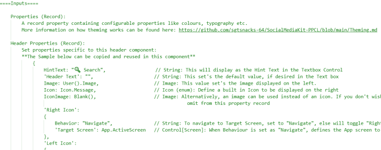
Here's an example of what I add to the ReadMe
Component Library Name
Component Name, maybe also include a description/use case
In the above example, I include an "override" section, as certain controls can be overriden for theming
Inputs: List all inputs, types and what their purpose is. Break down tables and records with an example
Outputs: List all outputs, types and what their purpose is. Break down tables and records with an example
Using new property types? Include Behaviours, Functions and Actions here. What are their inputs, outputs and their purpose/how to use.
Let me know what you think of this approach to providing documentation to other makers. I'd love to hear if you have any other approaches to this.


